 See more Shops
Casa Nostra
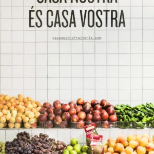
Casa Nostra "Our Home" is your home
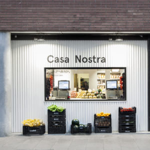
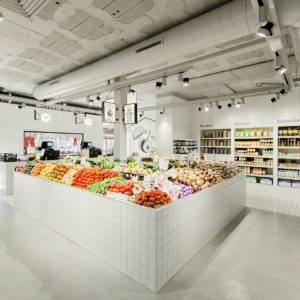
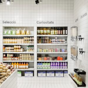
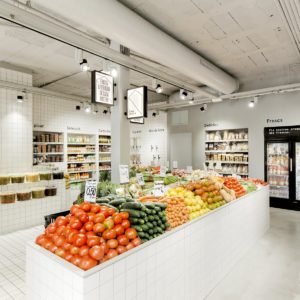
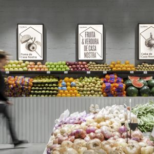
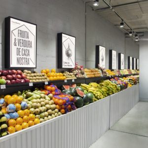
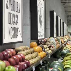
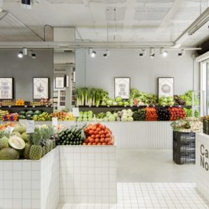
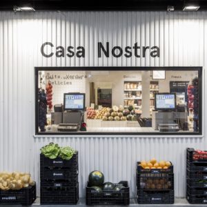
Casa Nostra Fruit Shop’s new image focuses on raising the product’s attention above everything. An interior design that avoids stereotypes, that has been applied uniquely monochrome in a space that does not need decorative elements, and that highlights its fresh and colourful products.
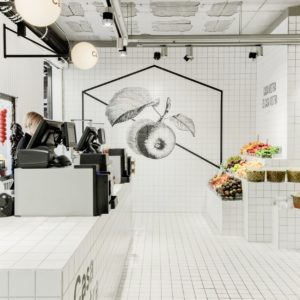
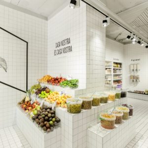
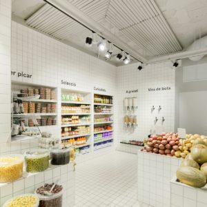
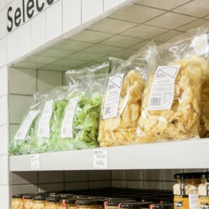
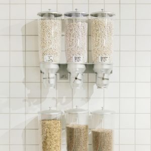
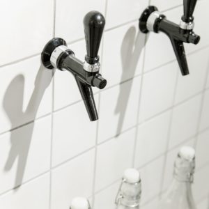
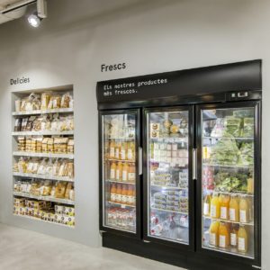
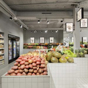
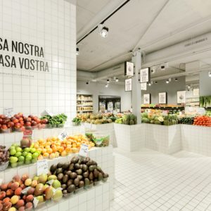
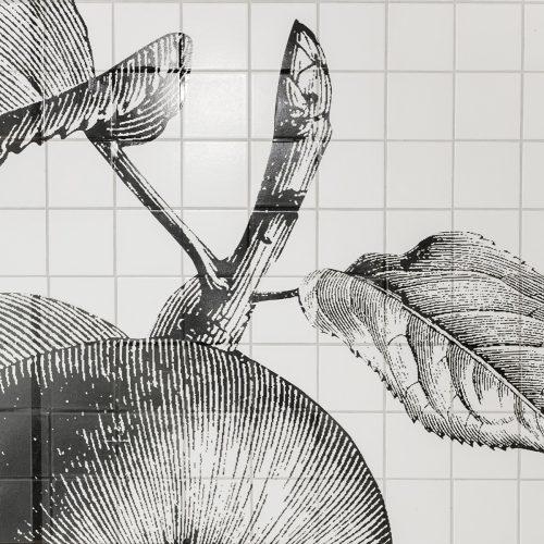
The design focuses on the use of two materials basically dividing the store into two areas, a white corrugated sheet in the entry zone for fresh products and matte white tiles that invade the second zone designated for packaged products.
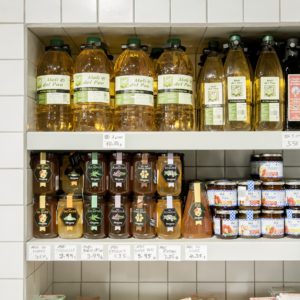
All furniture was tailor-made, like the set of central hubs made with metal frame and finished in tile, mark the path of the store. We have also created spaces in pillars and walls that serve as bases and alcoves for product exhibition.
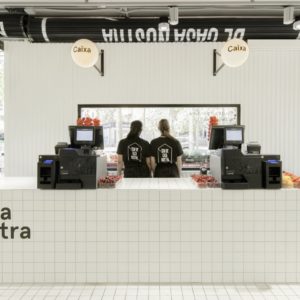
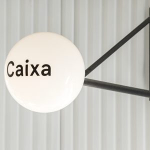
Decorative lightening was designed specifically for Casa Rostra, the two giant sconces on the counter are made of iron and glass and also work as a signal.
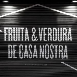
In the exterior facade we applied a corrugated sheet that brings a lot of personality to the Shop, and functions as a support for graphical image.
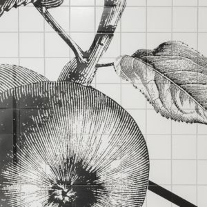
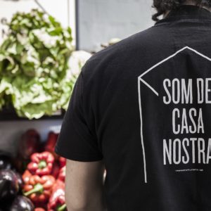
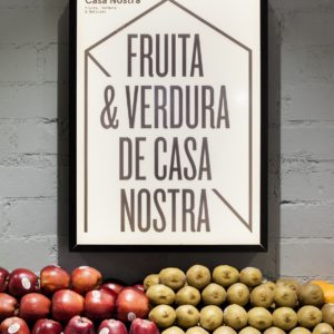
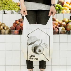
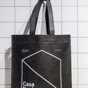
Designer Francesc Moret created the signage and graphic identity that are very present throughout the entire space, applied in vinyl on walls, tiles and also in all the posters and merchandising.
| Client | Particular |
| Surface | 70 m² |
| Year | 2016 |
| Location | Barcelona |
| Photographer | María Pujol |
